Human minds are more adaptive to the visual representation of data rather than textual data. We can easily understand things when they are visualized. It is better to represent the data through the graph, where we can analyze the data more efficiently and make specific decisions according to data analysis. Thus, graphics provides an excellent approach to exploring the data, which is essential for presenting results. Data visualization in python is a new term. It expresses the idea that involves more than just representing data in the graphical form.
Data visualization in python is a process in data analysis for visually representing the data. It graphically plots data and effectively makes the complex information more communicable.
Using data visualization, we can summarize our data visually as it makes easier to interpret it with pictures, maps and graphs, etc. Thus, Data Visualization in Python plays a significant role not only in the representation of both small and large data sets, but makes large data sets much more understandable by compressing it in the visual format.
Python provides us with various libraries to support data visualization. To plot and represent the data in Python codes, we will go through the some of the most popular Python visualization plotting libraries and how to use them.
These libraries are: -
Before using these libraries, they need to first installed. It can be done by either of the two ways mentioned below:
Each library takes a rather different approach to plotting data to compare them. I'll make an equivalent plot with each library and show you the source code.
Matplotlib is the oldest Python plotting library, and it is still the most popular amongst others. It was created in 2003 as a part of the SciPy Stack, an open-source scientific computing library almost like Matlab. Matplotlib is also a massive library consisting of many functions, and getting a plot correct is often achieved through trial and error. Using one-liners to generate some basic plots in Matplotlib is simple, but skillfully commanding the remaining 98% of the library functions can be daunting.
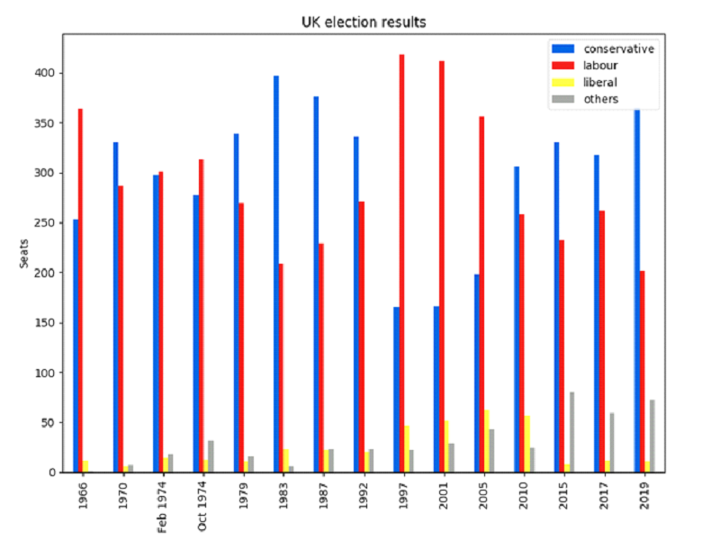
Matplotlib gives you precise control over your plots. For example, you can define the individual x-position of each bar in your bar chart. Here's the code to graph this:
And here is the chart plotted in Matplotlib:

Seaborn is an abstraction layer on top of Matplotlib, it gives you an elegant interface to make a wide range of useful data plot types very easily.
However, Seaborn doesn't compromise on power, though! It provides escape hatches to access the underlying Matplotlib objects, so you can still have complete control.
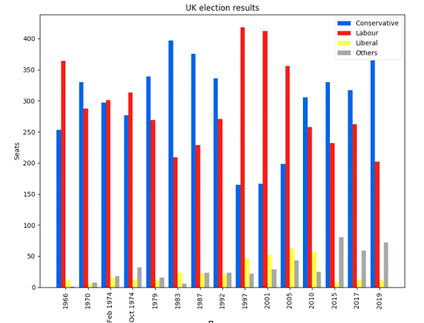
Seaborn's code is a lot simpler than the raw Matplotlib:

Pandas is a prevalent library in Python for data science. It allows you to do all sorts of data manipulation scalably, but it also has a very convenient plotting API. Because it operates directly on the data frames, the pandas' example is the most concise code snippet it's even shorter than the Seaborn code!
The pandas API is a wrapper around Matplotlib, so you can use the underlying Matplotlib API to get fine control of your plots.
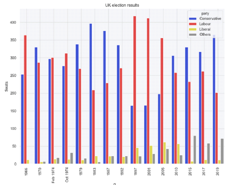
Here's the code for the plot in the panda's library & it is very concise:-

As we all know, data is a potent tool. Data being textually present is not enough to analyze the insights of an organization. To make data more useful and much more presentable, we require techniques or methods that enhance the data quality by representing it in a graphical form more than its textual format. Thus, we depend on data visualization processes to incorporate the present data and make it easier to identify hidden patterns and trends to provide big data solutions to the organization.
Check out Kockpit Analytics Pvt. Ltd. for more business intelligence products and big data consulting services purely concepted on data visualization techniques.
In this article, we have given an overview of what is data visualization and discussed major data visualization libraries supported by Python. Moreover, we have plotted a bar graph using Matplotlib Seaborn and Pandas.
Visualization has emerged as an important feature in the world of Big Data. Organizations have completely adopted the data visualization processes that in today's business universe, providing insights without any graphical representation or dashboards is meaningless. Therefore, to break down complex information to pertain to relevant insights and patterns, you require visualization techniques.
Ever occurred who deals with business intelligence solutions with integrated data visualization processes in the best way possible?
Well, you won't find anyone better than Kockpit in accomplishing this achievement. They provide you with Microsoft Power Bi consulting services and ETL solutions to various companies on-premise and cloud. They analyze their insights and produce hidden patterns, result-based strategies, and other resourceful information which can nurture an organization's growth.
Discover the most interesting topic