
The dashboard is to show a comprehensive overview of data from different sources. They are helpful for monitoring, measuring, and analyzing relevant data in critical areas. Power BI is a leading software that provides exceptional power BI services. It can track progress toward goals and spot early warning signs of issues.
Microsoft's Power BI is a cloud-based service, business analytics service for analyzing and visualizing data. BI stands for business intelligence. It helps extract insights, draw conclusions, and share results via reports and dashboards across various departments. Power BI is so prevalent in the BI domain. There are the following reasons:
It converts data from different sources to build interactive dashboards .power BI's ability to create beautiful dashboards and reports is one of the main reasons for its popularity.
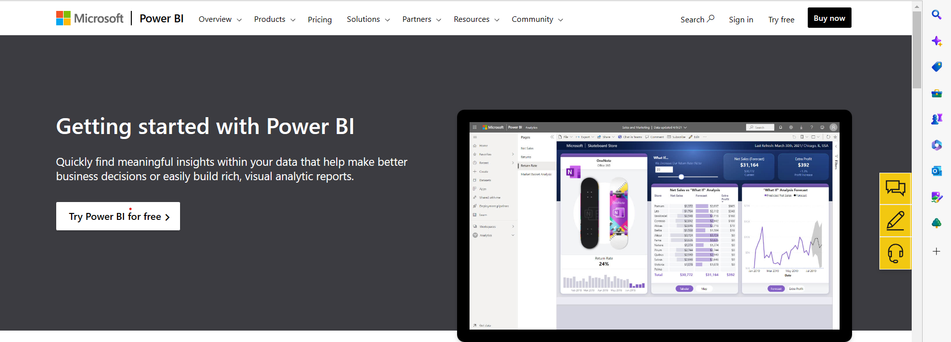
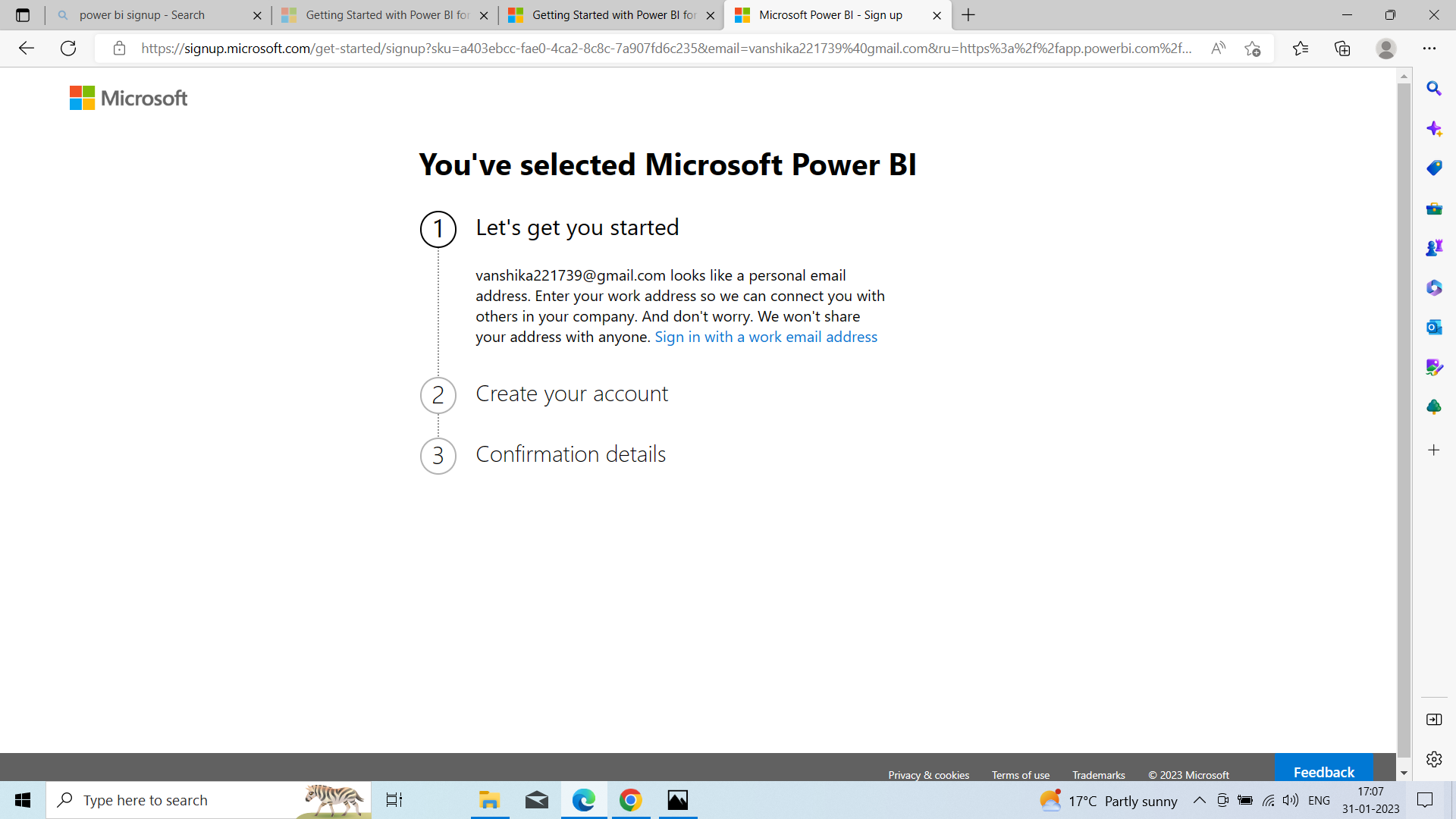
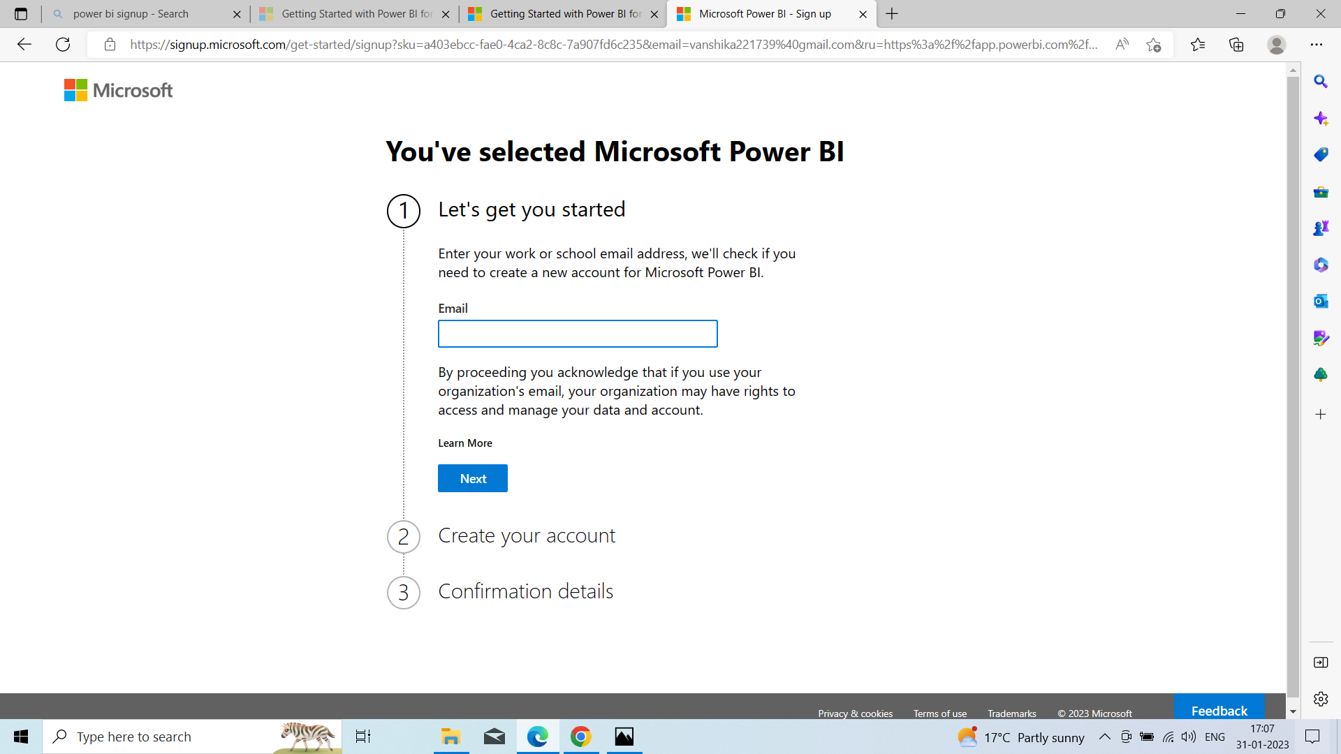
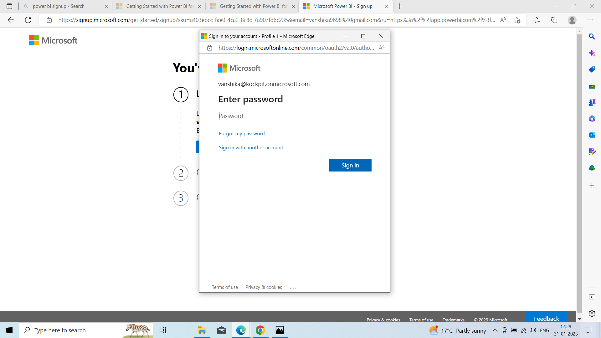
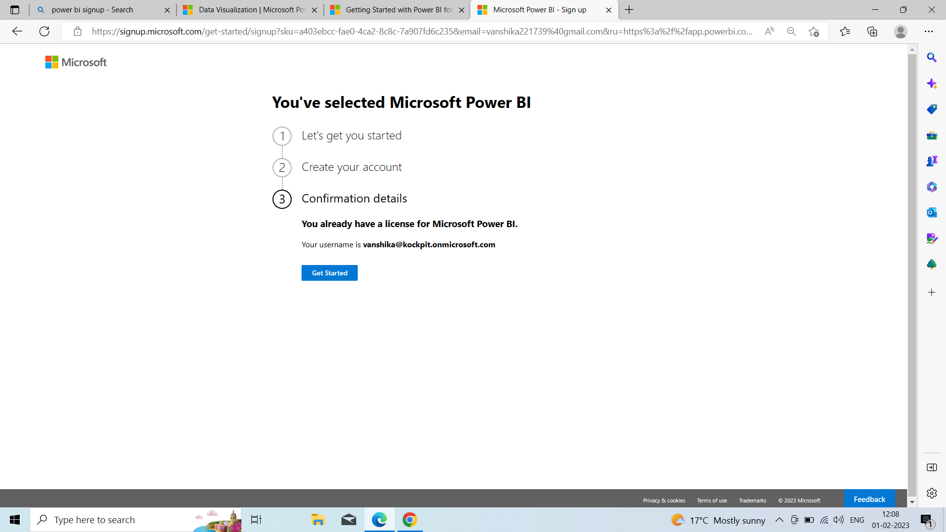
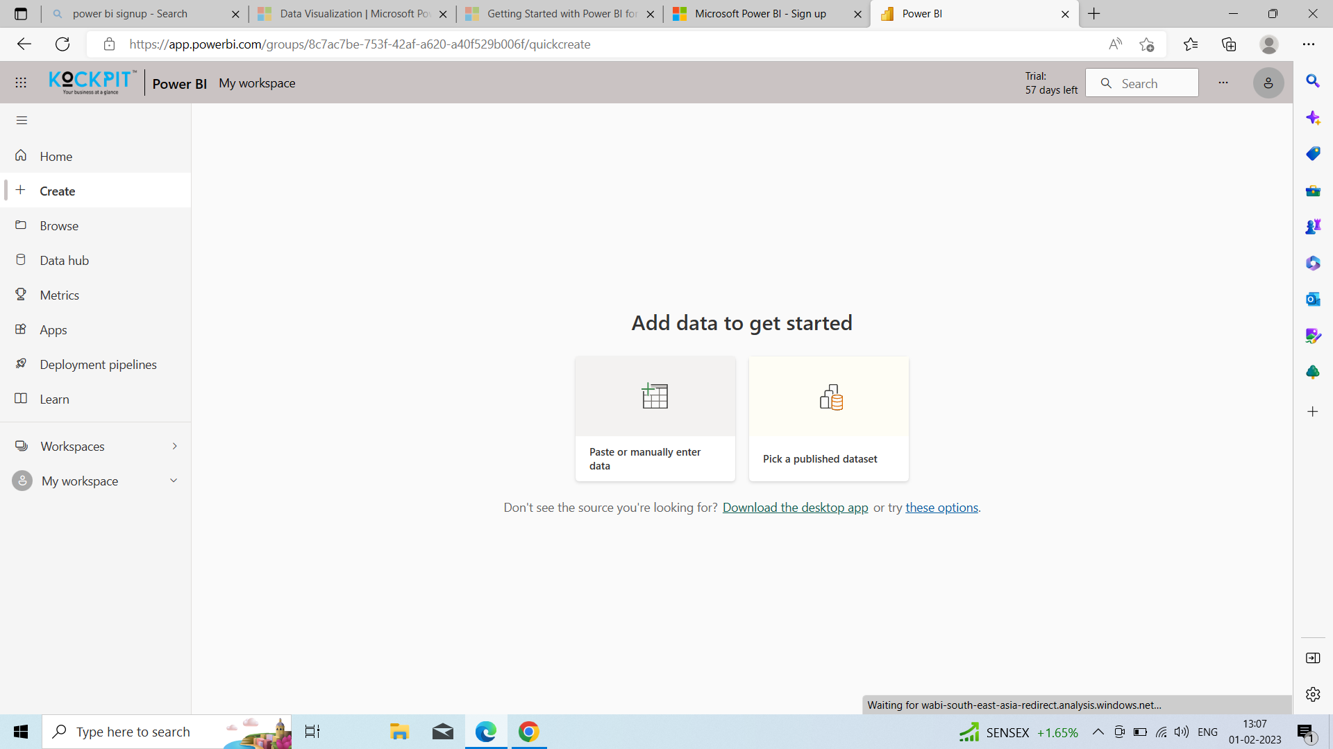
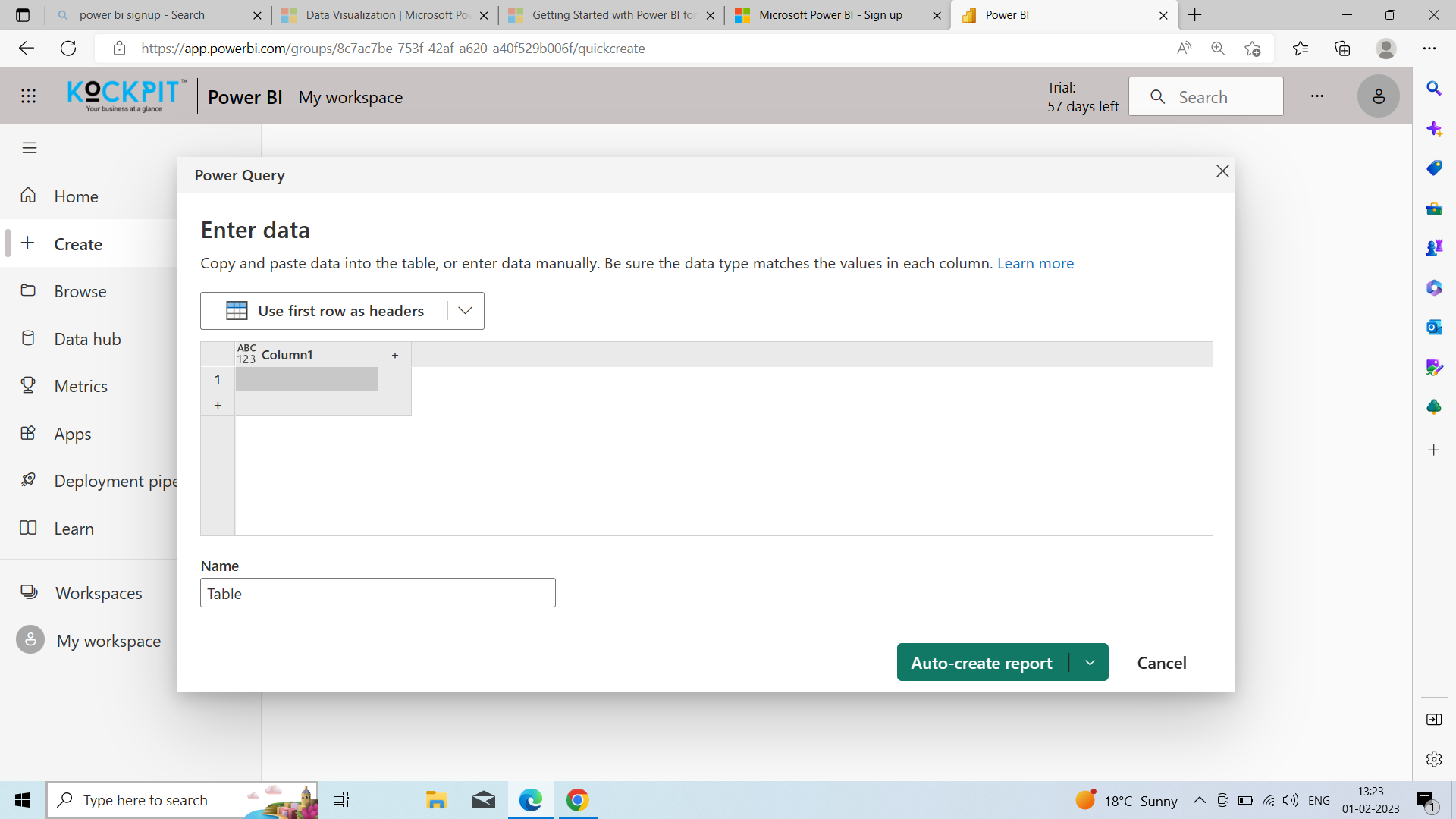
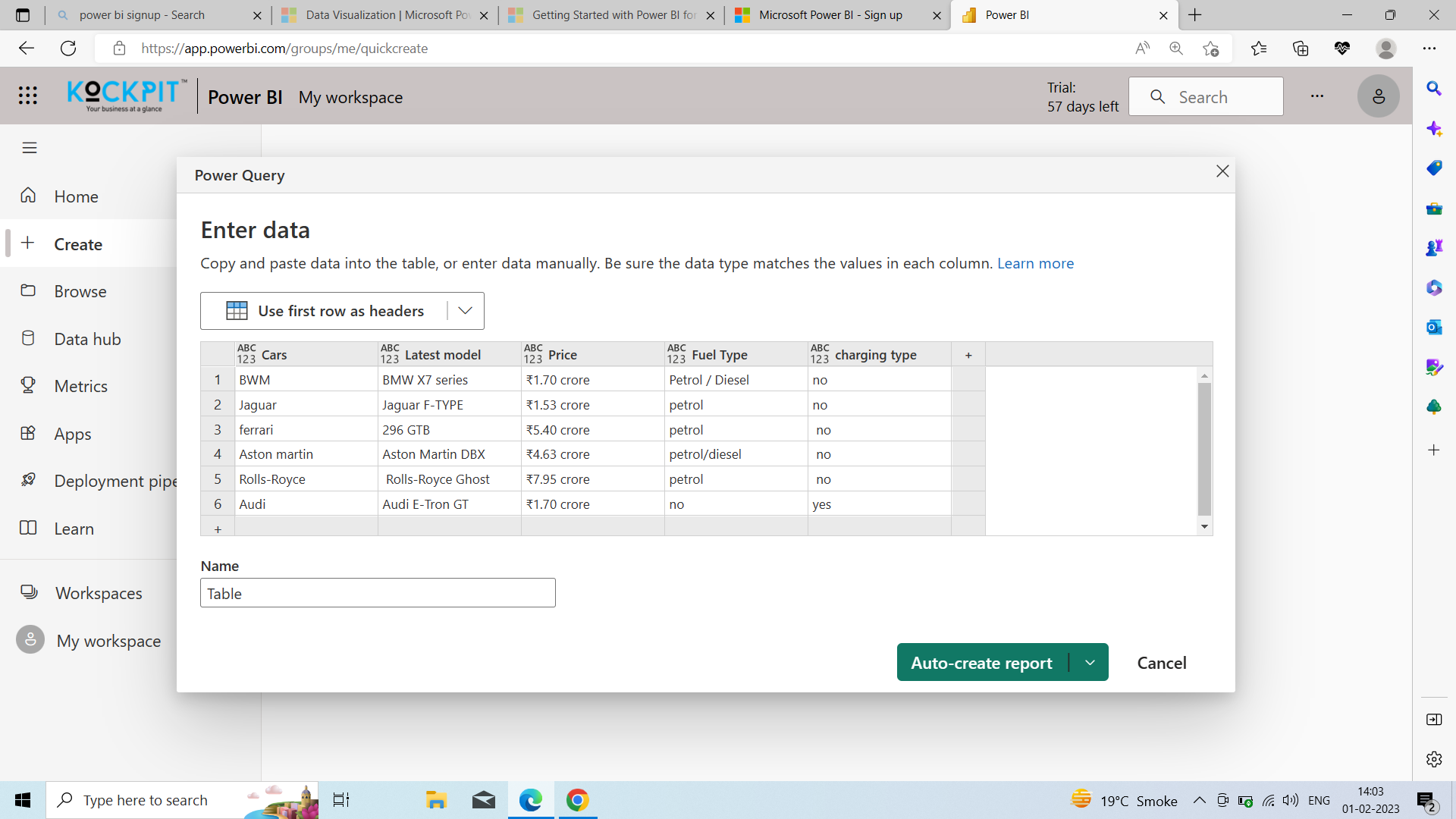
Follow these steps to sign up for a Power BI service. You can click on this link to sign up for your Power BI account. Once you complete this process, you will have a Power BI (free) license, which you can use to try the Power BI service on your own using my workspace, consume content from a power BI workspace assigned to a Power BI premium capacity, or initiate an individual Power BI trail.
The exact steps for sign-up can vary depending on your organization and are present with some of the screens shown below, and the steps in this article apply to the most common.
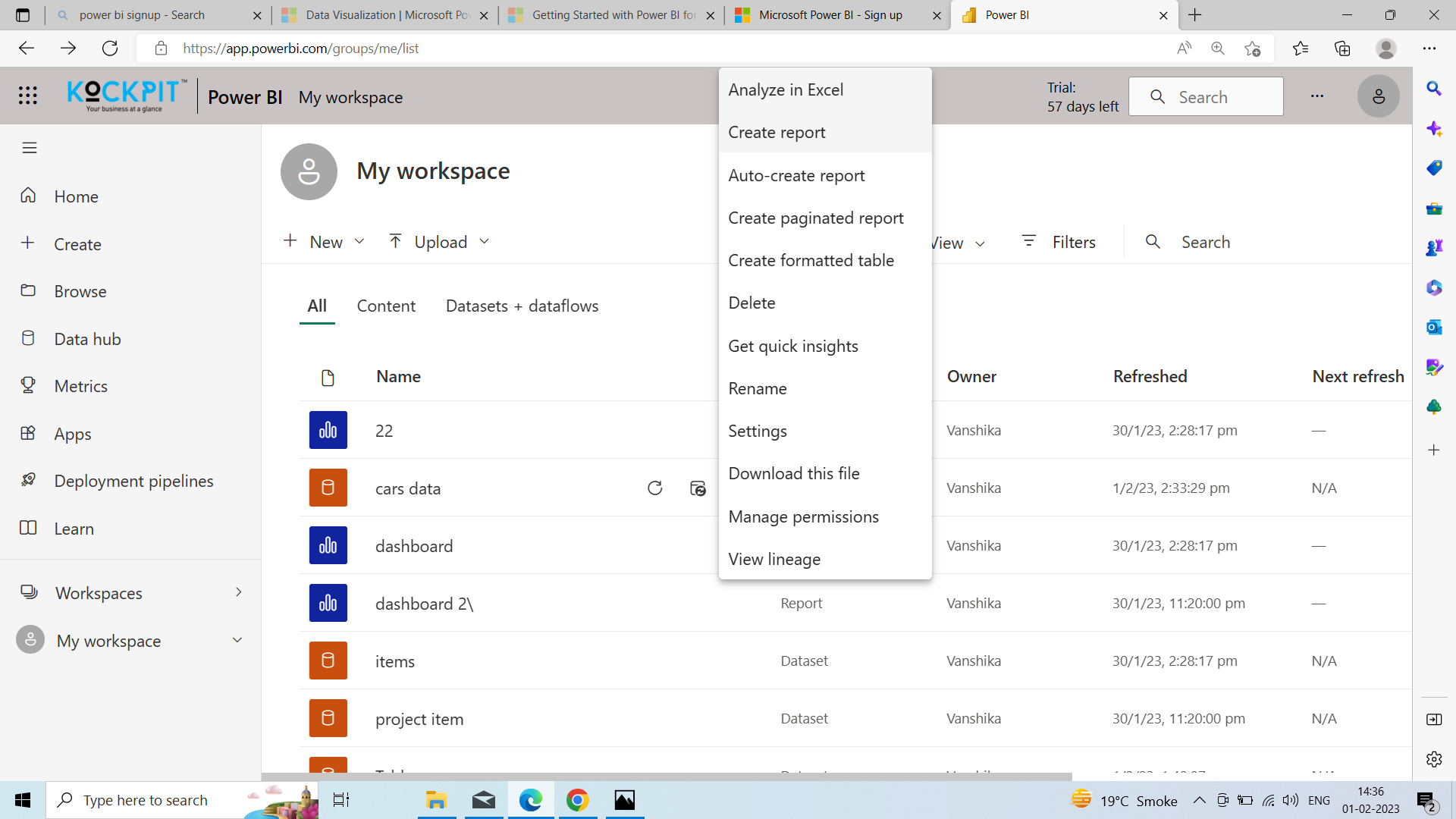
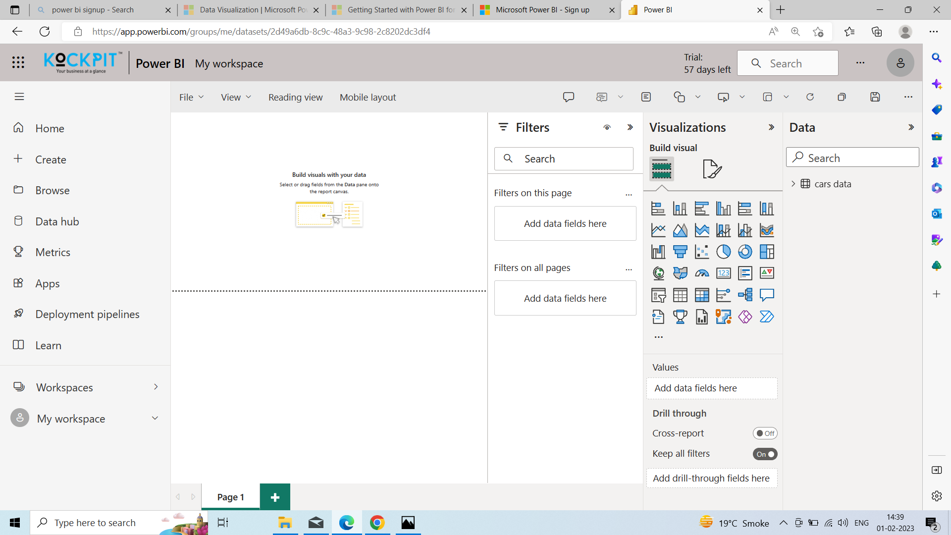
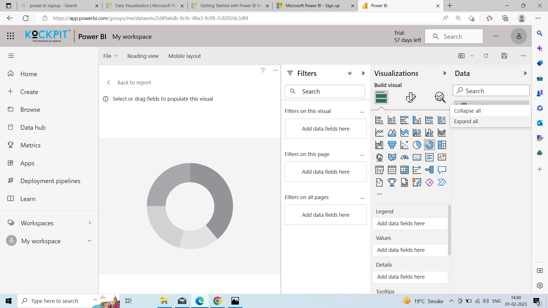
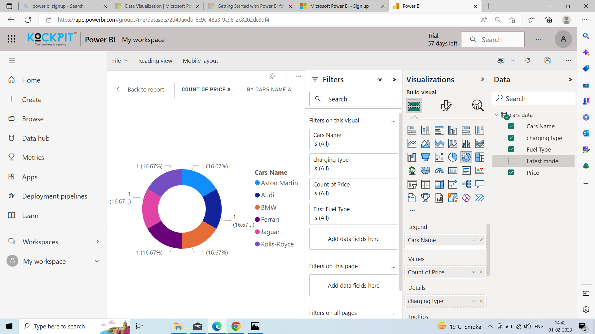
Power BI is a fundamental programming framework for organizations with vast amounts of disparate data developed during normal business operations. Let's see the practical uses of Power BI below:
In every business, Data comes from different sources. These sources reach the server at some point. Power BI service tools can manage all the business-related data at the server level. Power BI service ensures that the data is more extensive than the data you collected from a program working on pcs.
Your business needs to access data from the complete software system to manage it. Therefore, power BI merges with any software platform used to manage it. Power BI consulting services combine with any software platform used to manage businesses. This system consists of mail management, social media platforms, accounting software, CRMs, and traditional data platforms like Azure and MYSQL.
Power BI takes input from various sources and provides that data in multiple contexts, including embedded within your apps through API by Microsoft. In addition, power BI offers tools to manage a business, allowing app customization. Power BI also provides a product value-add feature to track and identify the key data sets regarding the product or service.
Power BI offers specific functionality to businesses in the form of a data management system/app to streamline the processes of different departments. Let companies use templates for intuitive dashboards and reporting systems instead of creating a system part-wise for your business.
Businesses spend fiercely on online marketing to attract customers. But the vast mass needs to convert while researching the solutions to their unique problems online in Power BI. In this case, Power BI services help you create a chart to track user behavior throughout their online visit.
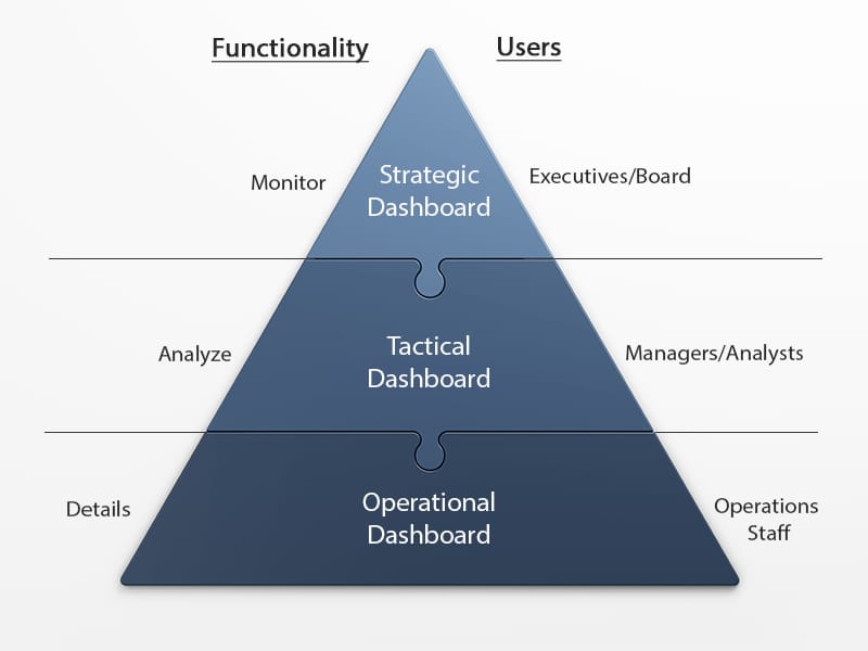
A strategic dashboard is a reporting tool for monitoring the long-term company strategy with the help of critical success factors. They're usually complex in their creation and provide an enterprise-wide impact to a business, and dashboards are used by senior-level management. However, when the strategic dashboards are developed correctly, designed, and implemented, they can reduce the time needed to accomplish a specific business key performance indicator while lowering operational costs.
Let's see this through 5 strategic dashboard examples.
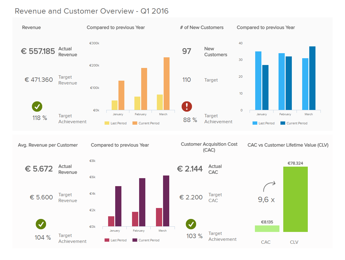
This management dashboard below is one of the best strategic dashboard examples that could readily display in a board meeting. It is clear, But it quickly tells a cohesive data story.
The dashboard focuses on revenue in total and at the customer level, plus the cost of acquiring new customers. In addition, the dashboard is set to a specific time frame and includes significant KPIs: Customer acquisition costs, customer lifetime value, and sales target.
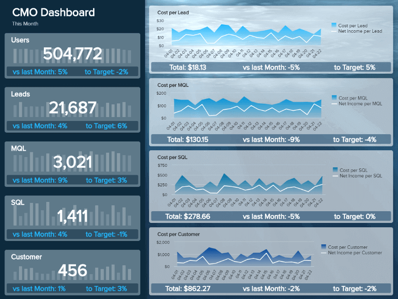
Another example comes from the marketing department. Chief Marketing Officers( CMOs) often need more time to check numbers such as traffic or CTR of specific campaigns.
However, in Power BI CMO strategic dashboard, they need to look closely at a more strategic level of marketing efforts, even cooperating with sales to reach the best possible marketing results a business can have and generate profit. In Power BI, Marketing dashboards like this help display these important strategic KPIs in a visual, informative, and straightforward way.
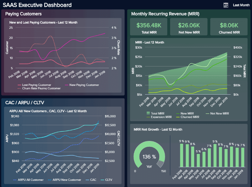
Our following example is another management dashboard focusing on the executive level of a SaaS business. Here, managers get an overview of the three most important areas for any software-as-a-service company:
In the Power BI saas management dashboard, Tracking these metrics closely and over time allows you to get a birds-eye view into relevant metrics from past, present, and future performance to optimize processes and ensure your business stays profitable over time.
Chief financial officers must keep a company's strategy on track, closely monitor the financial performance, and react when deviations are from strategic goals and objectives in the Power BI dashboard. But not only, but the finances of a company are also affected by non-direct factors such as employee and customer satisfaction with Power BI services.
For example, employees need more time to be satisfied with their working environment to avoid calling in sick or leaving the company, which causes financial bottlenecks. But let's take a closer look at what kind of dashboards for strategy CFOs need.
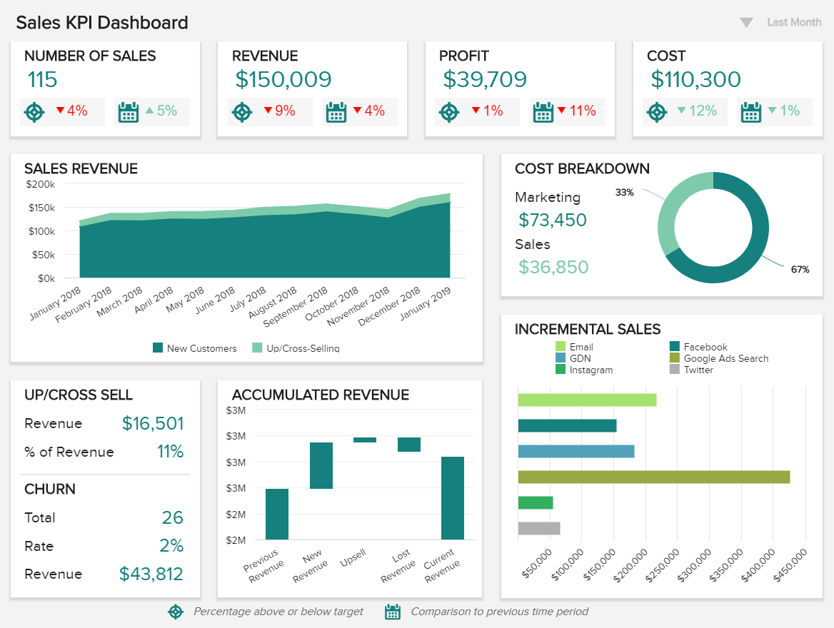
Moving on to our following strategic dashboard template comes a powerful sales BI tool. The sales KPI dashboards focus on high-level sales metrics that C-level executives and managers must closely monitor to ensure meeting goals.
An operational dashboard is one of the types of Power BI dashboards used for monitoring and managing operations with a shorter time horizon since they focus on tracking.
Their value in today's digital age lies in businesses realizing the importance of fast and correct data between operational teams and developments in Power BI.
While the unprecedented developments in dashboard reporting and analysis have simplified operational undertakings, operational managers can also greatly profit from using these kinds of dashboards and visually and interactively point to a real-time data issue that is expeditiously addressed.
Let's take a look at the marketing example, and now we will focus on an operations dashboard example for marketing purposes.
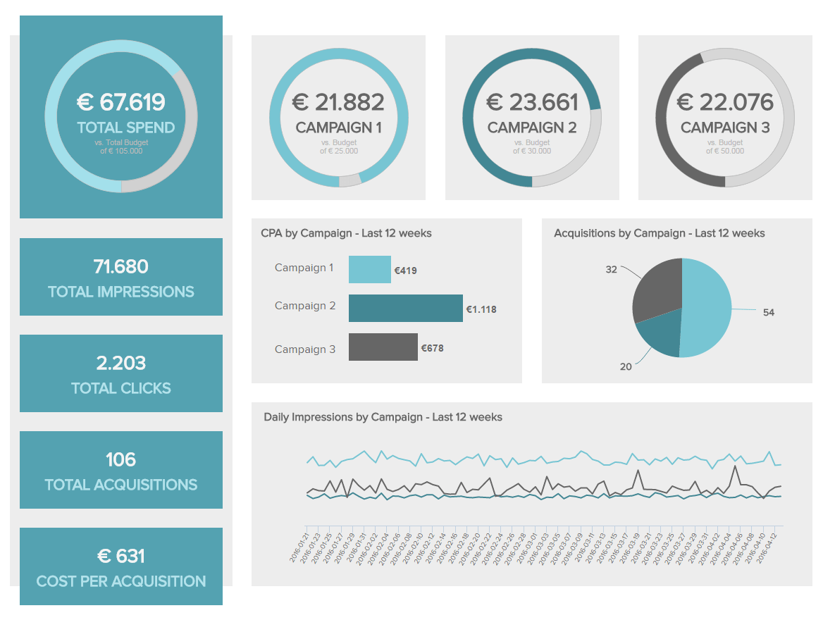
The marketing performance dashboard above is one of our top operational dashboard examples. It shows the performance of 3 campaigns over the past 12 weeks.
In Power BI marketing operational dashboard provides essential operational information and key performance indicators for the marketing team On a cost per acquisition, the total number of clicks, total assets gained, and the total amount spent in the specific campaign.
Any significant changes would immediately alert the marketing team.
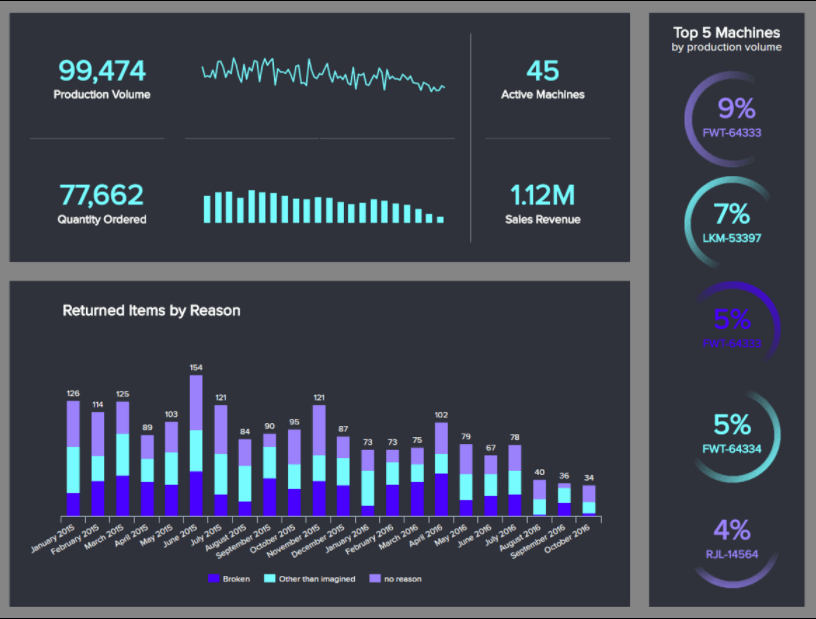
As we mentioned, an operational dashboard can be a perfect tool for tracking production. Let's look at our manufacturing dashboard example to put this into perspective.
This visual tool provides a detailed overview of all aspects related to production, from the volume, quantity ordered, and returned items to machines' performance.
This level of insight can help manufacturers spot potential issues or hidden trends that could harm production and find improvement opportunities to optimize critical processes.
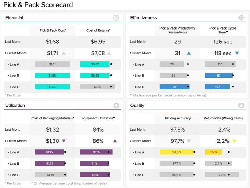
Our following example is a logistics dashboard tracking all aspects related to order processing.
Better known as pick and pack, it is the process in which a worker finds an item from an order in the warehouse and puts it in a box, or another type of packaging, to ship to the customer.
Tracking these metrics in detail allows businesses to optimize critical processes and save costs while ensuring quality service. So let's look into the dashboard in more detail.
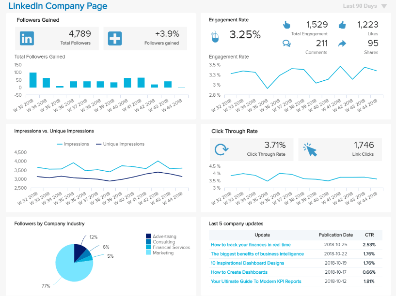
We continue our list of operational dashboard examples with Linkedin. This social media network is critical for building business relationships on a profile level or company. LinkedIn should be a higher priority for companies that want to reach decision-makers and business professionals.
To effectively manage a company's presence, companies can use operational data dashboards that will solve multiple social media problems such as automation, customization of reports, and provide advanced analytical features in Power BI. First, look at a working dashboard design example created for Linkedin.
A tactical dashboard analyzes and monitors processes conducted by mid-level management, emphasizing the analysis. Then an organization effectively tracks the performance of a company's goal and delivers analytic recommendations for future strategies in Power BI.
Tactical dashboards are often the most analytical dashboards. They are great for monitoring the processes that support the organization's strategic initiatives. In addition, tactical dashboards help guide users through the decision process in Power BI.
They capitalize on the interactive nature of dashboards by allowing users to explore the data.
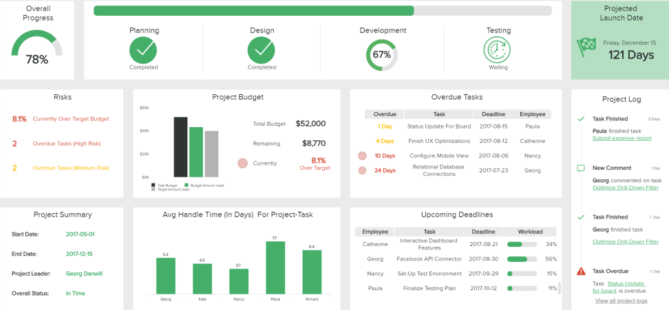
Let's see this through an example in project management.
The example below shows a detailed overview of a project with specific timelines and the efficiency of the parties involved. You can define particular risks, see the overall progress, and average the times of conducting specific tasks. After the project, you can create a comprehensive IT report, evaluate the results, and make future projects more successful.
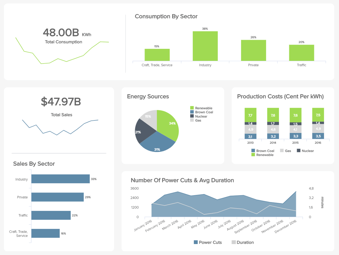
A powerplant provides energy to several sectors and industries, producing massive amounts of data daily with hidden trends and improvement opportunities waiting to be untapped.
This energy dashboard aims to do just that by providing you with an overview of every relevant aspect for the correct management of your energy relevant part for the proper administration of your energy business: from the total sales to the consumption by sector to the production costs per source type, you get the big picture of the different plant's performance.
It provides real-time comprehensible information, anywhere and at any time, and dashboards are a great tool in Power BI to aid in the monitoring and control processes within a project, program, and portfolio management in Power BI. Good dashboards convey good information in the most effective way possible while remaining attractive or looking attractive in Power BI. BI Data analytics and visualization tools to help businesses make data-driven decisions.
To achieve the best balance in Power BI, dashboard designers must be consistent, meticulously detail-oriented, and choose the best design to convey the information effectively. A Power BI Dashboard can track progress toward goals and spot early warning signs of issues. They can monitor key performance indicators(KPIs) in real-time, identify areas of improvement, and make decisions that will help you achieve your desired outcomes in Power BI. Dashboards are a feature of the Power BI service.
Discover the most interesting topic