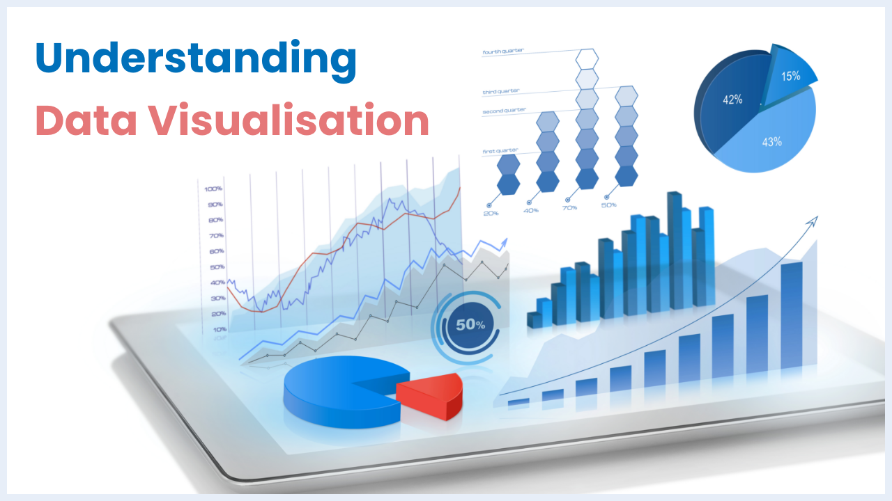
Our world is awash in data, and data visualization is your key to unlocking hidden insights within that data and making informed decisions. By 2025, the global data sphere will balloon to a staggering 163 zettabytes – that's ten times the data generated in just 2016! As Google's former CEO, Eric Schmidt, aptly remarked, “Every two days now, we create as much information as the entire 20th century.”
Navigating this information deluge is no easy feat. However, data visualization offers a powerful tool for transforming raw numbers into clear, compelling stories. Imagine bar charts revealing hidden trends, scatter plots highlighting crucial correlations, and heatmaps pinpointing areas of opportunity. These visual narratives empower you to analyze data with unparalleled clarity, leading to smarter decisions and strategic success.
Having explored diverse data visualization techniques myself, I'm here to guide you through this fascinating realm. This article will equip you with the knowledge and tools to unlock the secrets hidden within your data, transforming you from a passive observer to a confident decision-maker.
Data visualization is a powerful concept that can be used to communicate information in a visually appealing way, making it clear and concise.
Below are a few real-life examples of data visualization you might have come across. Can you guess by looking at the following images?
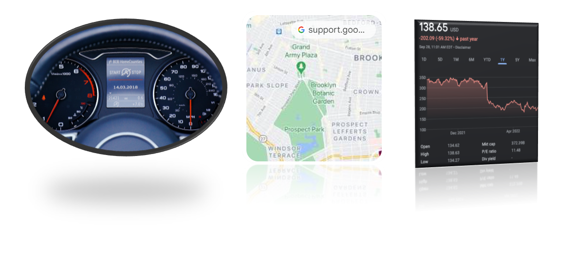
The first data visualization is an in-car dashboard.
The second data visualization helps navigate roads with ease.
The third data visualization represents stock market trends.
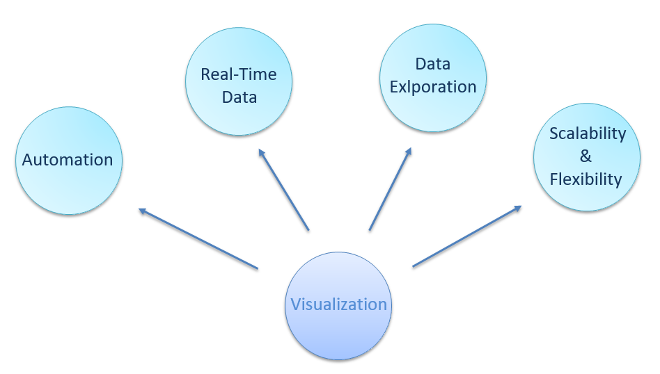
Data visualization software offers significant technical and quantitative advantages for companies with large datasets and complex data needs.
The advantages in brief are given below:
Each visualization represents data differently, i.e., insights drawn from one chart may be deeper than another. Below are the frequently used visualizations in a dashboard.
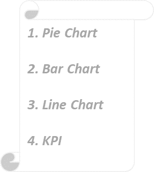
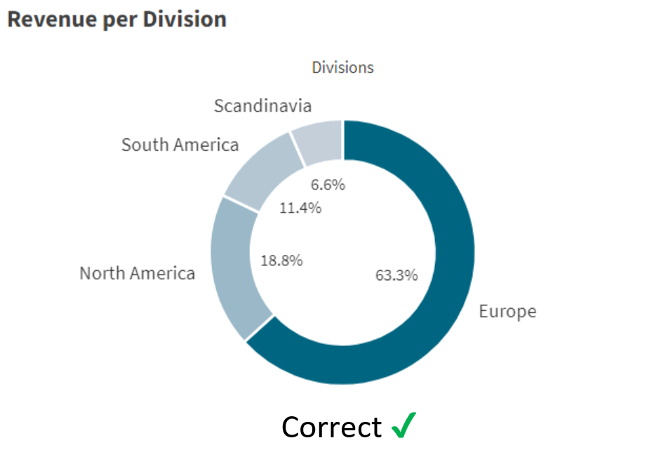
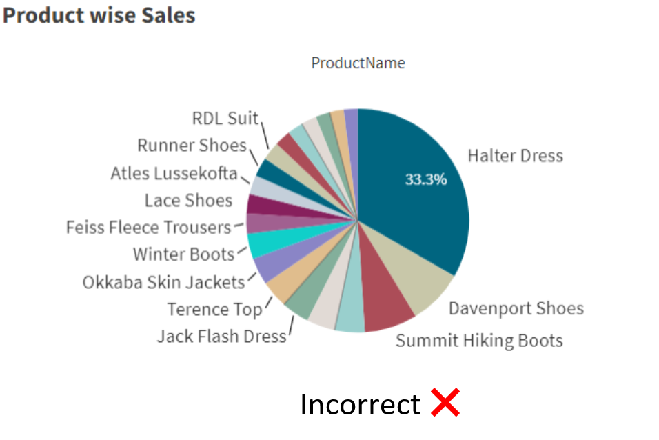
The Pie Chart represents slices of grouped data (categories) as a percentage of the whole. This chart helps users identify which category from the pie has the highest/ lowest contribution.
Below is an example of its usage!
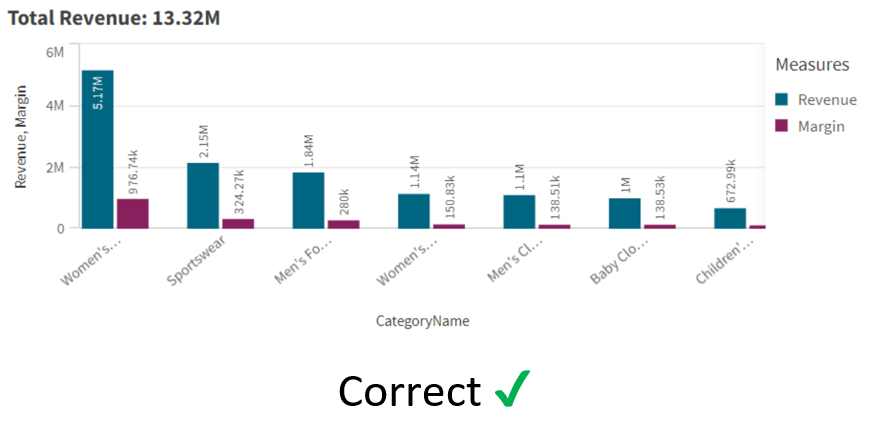
A bar chart represents the data volume by its length, i.e., the longer the bar, the higher its value. There are three types of bar charts, each uniquely representing data.
Here is an example of its usage.
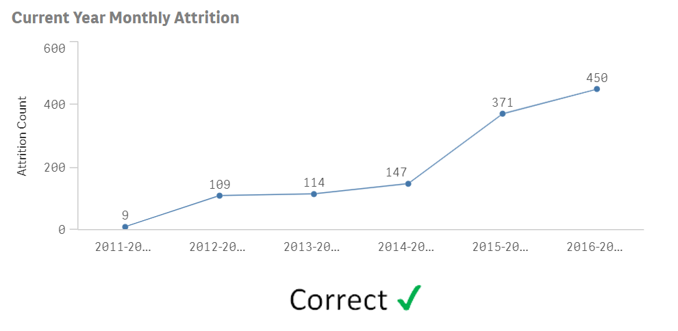
The Line Chart extraordinarily represents trends with the dataset. When the line in the chart goes down, it generally denotes some kind of loss and vice versa.
Below is an example of its usage.
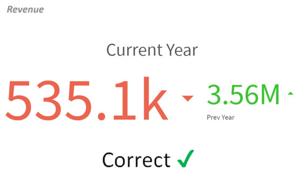
It lives up to its name, i.e., it is used to display the metrics that are most relevant to indicate the growth/ downfall of a company. Below are some key metrics:
Data visualization tools are your key to unlocking the hidden potential within your data. Since William Playfair’s pioneering work in 1786, these tools have evolved into powerful allies for businesses and individuals alike.
But with hundreds of options, navigating the data visualization landscape can be daunting. This guide spotlights four leading tools — Power BI, Qlik, Tableau, and Google Charts — helping you identify the perfect partner for your data storytelling needs.

Microsoft Power BI scales seamlessly from solo projects to enterprise dashboards. Harness its AI superpowers like automatic insights and anomaly detection to unlock hidden patterns within your data.

Tableau thrives on its robust community and intuitive user interface. Drag-and-drop your way to stunning visualizations, empowering even beginners to become data storytelling gurus.

Google Charts shines as a budget-friendly champion. Its free access and ability to handle dynamic data make it ideal for quick visualizations and prototypes, injecting insights into projects of all sizes.

Qlik boasts a revolutionary associative engine, instantly connecting seemingly disparate data points like scattered puzzle pieces. Its seamless dashboard embedding makes sharing insights a breeze, democratizing data across your organization.
Choosing the right tool depends on your unique needs. With this roadmap in hand, confidently embark on your data visualization journey and transform your numbers into stories that inspire action.
In a world saturated with data, it’s easy to feel overwhelmed. But with data visualization, you have the power to transform overwhelming numbers into captivating stories. These stories reveal hidden trends, illuminate crucial connections, and empower you to make informed decisions. Dive into the world of data visualization tools, unlock the secrets within your data, and watch your insights transform not just your decisions, but your world.
Discover the most interesting topic